Today: A quick look at some of the more... dubious.... fashion choices of US Soccer over the last few years, in our AWAY jerseys.
Honestly, the last really good US jersey in my opinion was the 1998 US jersey for qualifying (but then discarded by US Soccer for the actual World Cup!). I bought that one (retail!!) and it's still the only US jersey I own. I will buy a new one when they produce a new one worth buying (though I admit the current home jersey, white with the faint gray "sash," is probably the least offensive since 1998).

First up is the 1994 away jersey from the World Cup. US Soccer told Nike to "Wr ap the boys in the flag," and Nike complied. It has a sort of denim look, but was not denim. The "home" jersey that year was an even-more-hideous white shirt with lots of thin red vertical stripes. Eeeek.
 ap the boys in the flag," and Nike complied. It has a sort of denim look, but was not denim. The "home" jersey that year was an even-more-hideous white shirt with lots of thin red vertical stripes. Eeeek.
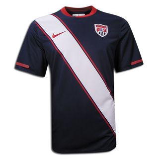
Next is the 2010 US away jersey for the World Cup. You're about to see a lot of this one, as the US will probably be the "away" team when we open on June 12 against England. I think it's only marginally better than the denim stars deal from '94.

8 comments:
The faux-denim look from 94 remains my least favorite.
I just wish they'd settle on one classic design and leave it alone.
Some kits you don't mess with: Brazil, Argentina, Spain, Italy...
As soon as we pick one and stick with it I'll buy one.
Right now my international jersey collections consists of: Costa Rica, Switzerland, Honduras and Italy.
Hello!
I found your blog looking for some information about usa soccer jersey and your blog is great!!!
Congratulations!!!
US election: Donald Trump open to talks with North Korea Republican presidential candidate Donald Trump says he is willing to meet the North Korean leader to replica omega discuss Pyongyang's nuclear programme."I would speak to him, I would have no problem speaking to him," the businessman said of Kim Jong-un.The proposed meeting would mark a significant change of US policy towards thpolitically isolated regime.Democrat front-runner Hillary Clinton responded bdecrying his "bizarre fascination with foreign strongmen".The statement, from onof her aides, added replica watches uk that Mr Trump's foreign policy "made no sense".In a separate development, the BBC has learned that Mr Trump could visit the UK before the presidential election in November.Diplomats expect his visit to the UK could happen after he formally becomes the Republican party replica rolex candidate at a convntion in July.On Tuesday he released financial records claiming he holds $10 billion (£6.9 billion) in assets, although he has so far resisted calls from Democrats to release his full.
He aquí un artículo de revisión de vídeo de un reloj Rolex Datejust réplica que es ligeramente diferente de lo que se encuentran regularmente en la colección Datejust. Los relojes Rolex Datejust réplica son definitivamente
replica horloges nederland uno de los modelos más populares de Rolex para obtener clonado por lo que habrá muchos de ustedes interesados en este modelo, estoy seguro. ¿La pregunta aquí es cómo usted tiene gusto de su bling?
¿Te gusta como un clon muy bueno del original o puede ser una composición diferente, siempre y cuando tenga el brillo, brillo y calidad correcta. Por supuesto, la respuesta de mi amigo (el dueño de esta pieza) fue que replica rolex realmente le gustaba el reloj como lo es, a pesar de que coincide con un original será un poco difícil. Sin embargo, siguió diciendo, hay tantas variaciones de Datejusts que es un buen modelo para ser representado por un espectador diferente.
Toujours devriez replique montre garder un œil sur les ventes Black Friday watch! Qui ne voudrait pas obtenir une bonne affaire, comme à moitié sur sa montre préférée? Croyez-moi, tout le monde. C'est pourquoi nous devons toujours être à l'affût des ventes de vendredi Black Friday, qui ne viennent qu'une fois par an, avec de grandes affaires et des bonnes affaires. Et ce n'est pas une mauvaise idée de planifier un peu, parce que Noël est juste copie montre au coin de la rue et je suis sûr que personne n'aime à s'asseoir autour d'anxieux, se demandant si ses achats de Noël arriveront à l'heure. Plutôt que d'être incertain, mon conseil est de tirer le meilleur parti d'une affaire Black Friday watch et juste s'asseoir et se détendre quand tout le replique de montre monde est dans cette ruée de Noël.
Montre Replica Watch Omega Ladies
Donc, nous avons tous acheter des replique breitling comme un fou ce vendredi noir sur www.perfectwatches.to parce qu'ils avaient 50% de réduction sur tout. Je pense que nous avons juste un replique montre de luxe peu plus d'une douzaine dans notre ordre seul et je sais que d'autres amis qui ont commandé leurs propres aussi. J'essaie toujours de tirer quelques-unes de ces montres pour les commentaires pour replika klockor vous les gars, mais les choses ne fonctionnent pas toujours comme je voudrais qu'ils.
¿Falso o real? Sé que ustedes no esperan una verdadera revisión de Rolex de mí en cualquier momento porque sólo para replicas relojes espana tener los medios para hacerlo, pero creo que están recibiendo el punto que estoy tratando de hacer aquí. Me gustan los toques finales y la apariencia de esta réplica Daytona Cosmograph. El buen oro amarillo chapado Rolex logotipo y los números y las manos y los cronógrafos también son de oro amarillo. Me encanta el dial azul porque lo hace tan especial y le da un aspecto diferente. Es como un condimentado replicas rolex Daytona que es más divertido de llevar que un modelo regular en mi opinión.
Donc, nous avons tous acheter des montres fausses comme un fou ce vendredi noir passé parce qu'ils avaient 50% de réduction sur quoi que ce soit. Je pense que nous avons juste un peu plus d'une douzaine dans notre ordre seul et je connais d'autres amis qui ont commandé leurs propres aussi. J'essaie toujours de tirer certaines de ces replique montre pour les commentaires pour vous les gars, mais les choses ne fonctionnent pas toujours comme je voudrais qu'ils.
Thank you for sharing such useful information in this article. We understand that soccer hero or soccers which is why we strive to make the process as simple and painless as possible. If you're looking for experienced Usa Soccer Jersey and the surrounding areas, you've come to the right place.
Post a Comment